Key Takeaways
Ever found yourself squinting at a teleprompter, trying to make sense of the text? You’re not alone. Losing your place in the script or struggling with readability can be frustrating, especially when all eyes are on you.
A clear, readable teleprompter display can help you focus on delivering your message confidently and connecting with your audience.
And how can you achieve that? Customizing your teleprompter display for better readability.
In this blog post, we will explain the basics of teleprompter displays, show you simple adjustments you can make for optimal clarity, and even discuss some advanced techniques for a more personalized experience.
Let’s get started by understanding the essential elements of your teleprompter display.
Teleprompters come in various forms, primarily categorized into software-based and hardware-based models.
Regardless of the type, most teleprompters share key features like font size, color contrast, scrolling speed, and layout options.
By grasping these basics, you set the stage for customizing your teleprompter display effectively, which we'll explore in the next section.

Now that you know teleprompters and their features, let’s explore how to customize your display for better readability.
One of the most critical aspects of readability is the font you choose. A font that’s too small can strain your eyes, while one that’s too large may require you to shift your gaze frequently.
Best practices:
If you're using FoxCue, their intuitive software allows you to customize font sizes and styles effortlessly, ensuring you find the perfect balance for your presentation.
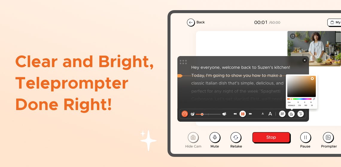
The color combination between your text and background significantly impacts readability. High contrast is essential to ensure your text stands out. You should test your color choices in the environment where you’ll be presenting.
Best practices:
By ensuring the right font size and color contrast, you will be well on your way to creating a readable teleprompter display. Next, let’s discuss how to optimize the scrolling speed and layout.
The scrolling speed of your teleprompter is essential. If the text moves too quickly, you might lose your place; if it’s too slow, you can lose your flow.
Best practices:
The layout of your teleprompter display can also affect readability. Depending on the complexity of your content, you can choose between single-column or double-column layouts.
Best practices:
Adjusting these aspects will create a teleprompter display customized to your needs. Let’s move on to more advanced customization strategies.
With features like dynamic background adjustments and adjustable scrolling speed, FoxCue Has You Covered!
Now that you’ve mastered the basics, let’s explore some advanced strategies for customizing your teleprompter displays to enhance readability and usability further.
Modern teleprompter software like FoxCue offers a range of features, such as customizable scrolling speed, font size and text, green screen replacement, and more, that can help you take your customization to the next level.
Mobile teleprompter apps can be a game-changer, especially for presenters on the go. FoxCue offers a mobile-friendly version that allows you to customize your display directly from your smartphone, iPad, or tablet.
Best practices:
With these customization strategies, you can further refine your teleprompter experience.
Ultimately, a perfectly customized teleprompter display is about more than just readability; it's about transforming your entire presentation experience.
By adjusting font sizes, colors, and backgrounds, you’re not just making your script easier to read—you’re making it more intuitive, engaging, and reflective of your style.
The true power of a teleprompter lies in its ability to adapt to you, not the other way around. So, experiment with your settings and see how the right customization can bring your words to life.
It’s time to make every presentation not just seen but felt!